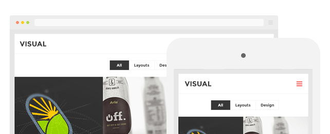
With WPBakery Page Builder responsive option your content will be accessible on desktop and mobile devices. No extra steps or programming required. Control how stacking behaves on different devices, define offsets of your choice, and hide particular elements on specific device types. Take full control over responsive design and get the best possible responsive WordPress sites. You do not require any programming skills to come up with pro-UI-looking responsive sites – WPBakery Page Builder will do it for you. Control the size of columns on different devices with just a few clicks and ensure that your customers receive the best readability and user experience while visiting your WordPress site on mobile devices or tablets. Forget about media queries, just choose the device type of your choice and simply fine tune settings you wish.
You have seen tons of responsive page builders, but none of them is backed up by WordPress which is the top favorite web platform in the market with the fastest growth and popularity rate.
Moreover, within the settings page, you can fine-tune your layout and set when exactly your content should adapt to the mobile screens. Do not want responsive design? No problem – within the same settings page you can switch off responsiveness and your content won’t get stacked whenever someone views your website on mobile or tablet.