Don’t Let Your Clients Break Their Website’s Layout
As someone who’s technical enough to understand the guts of WordPress but works daily in marketing, I’ve seen the disconnect firsthand: most page builders aren’t made for non-technical users. And by that, I mean the people who actually have to live in these websites – marketing managers, content editors, comms teams. People like me.
WordPress gives us many tools to build and manage websites. But most of those tools – yes, even the shiny new ones – are aimed squarely at developers, or ‘creators’ with more than basic understanding of code. They require a level of knowledge that most clients simply don’t have, nor want to acquire.
Breaking website layouts is one of the concerns, but not the only one. The list of things a client can mess up is long, but accidentally moving blocks of content, or changing sizes of rows or columns, is very noticeable on the front end. So, as you continue reading this post, bear in mind that I’m focusing on one of many ‘disasters’ that can strike the reluctant developer (aka the business user tasked to update the corporate website).
The Promise vs. Reality of Gutenberg
Let’s start with Gutenberg, which in my view has failed to deliver on the usability promise.
Its mission was to make content creation and even layout building accessible to everyone. But it hasn’t won many hearts.
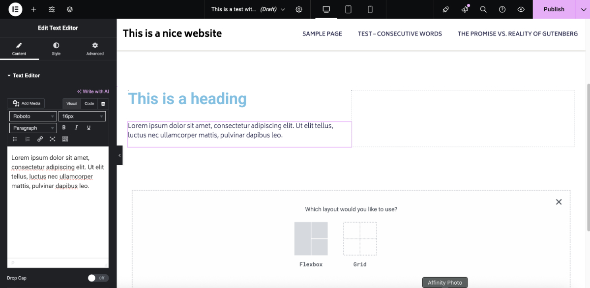
Have you tried to create rows and columns on a page? Just trying to interpret what each icon is and does is a challenge, and it’s not just me saying it.
As ProjectManagers.net put it:
Gutenberg’s transition to a block-based editor presents a daunting learning curve that cannot be overlooked. This complexity starkly contrasts the simplicity WordPress is famed for, potentially alienating long-time users.
In fact, over the past two years, I’ve noticed something telling: more than 70% of Themes published to the WordPress Theme Directory are still Classic Themes. That’s not necessarily a failure – it’s WordPress doing what it’s always done well: giving developers ultimate control. Data suggests that Blocks are not the preferred option.
Gutenberg, while powerful, comes with a steep learning curve. Yes, there’s Block Locking. Yes, layout flexibility is possible. But it still expects the user to understand technical concepts like the CSS model for layouts, responsiveness, applying paddings, margins, etc…

Getting lost when trying to create a two column row.
Here’s a list of what can go wrong:
- Users that have direct access to styling controls risk messing things up
- The lack of a Fixed Grid System gives users freedom and power – but no guardrails
- No real-time responsive guidance
- Block nesting can get overcomplicated and messy
That said, if you talk to folks working on Enterprise projects they’ll tell you how they’ve addressed and solved each of these issues. But these are big projects with big budgets, and the workarounds are costly. It’s fair to say that these are ‘out of the box’ limitations.
Visual Page Builders: Democratizing Dev Work, But Not Usability
Builders like Elementor, Oxygen, Bricks, and the rest of the modern crop have transformed how developers and designers work. They’ve enabled them to ship complex, dynamic sites faster than ever. They’re powerful. Flexible. Kind of like design-focused IDEs. But here’s the catch: They’re still too complex for non-technical users.
You wouldn’t ask your client to tweak CSS or debug layout issues in a codebase – so why hand them a page builder that requires more than a basic understanding of CSS and developer workflows?
Take this quote from WHT Solutions:
While Elementor’s extensive features can be overwhelming for beginners, the interface itself might take time to master and not all features are intuitive.
Exactly.
Non-technical Elementor users need to learn the difference between the Flexbox and Grid methods for layout.
Even with permission controls or partial locking features, these tools often allow users to change fundamental styling – like margin and padding – that can completely break a layout. That’s a problem.
Maybe AI will help mitigate these risks, but as things stand now, clients need to be trained to use visual page builders. And keep on learning, because these tools gain sophistication and complexity over time.
The “Custom” Workaround: Custom Fields and Custom Post Types
Many developers take another route: lock everything down. Use custom post types and custom fields to separate content from design entirely. Users just fill out fields in the backend. This works well if your workflow is rigid, which I’m actually a big fan of, particularly when we’re talking about publication workflows.
But what if the client wants to change layout or tweak design? Now they’re calling you again. That’s fine if you’re billing hourly – but not great if your goal is to empower them to self-serve.
Many developers have used plugins like Advanced Custom Fields for this, creating separate Custom Post Types for different content (for example, a ‘Books’ Custom Post Type). It looks like a much less sophisticated approach than using a visual page builder, but I’m 100% sure most day-to-day users adding and managing content prefer it over having to use something like Figma.
This also represents the Theme-first approach. That is, a developer creates a Theme with a set style and page types, and provides the user tools to manage content without the ability to to change the underlying information architecture. One of these is WPBakery.
The WPBakery Approach: Design That’s Flexible, but Unbreakable
This is where WPBakery stands apart.
The foundation is a 12-column responsive grid system. You can create layouts with one column, two columns (say, 40/60 split), three columns, and so on.
Rows and columns can be added, reordered, or modified – but always within the safe boundaries set by the grid.
And here’s the key: WPBakery respects the design system of the theme. That means a developer can hand over a site without worrying that the client will accidentally nuke the visual integrity of the layout. The site stays on-brand. Consistent. Professional.
Clients can publish new content quickly and painlessly – without needing to learn the intricacies of front-end development.
A lot of people consider this the legacy way of building and managing websites. But you know what? It’s a paradigm that has worked well since they were introduced with WordPress 1.5 which was released twenty years ago.
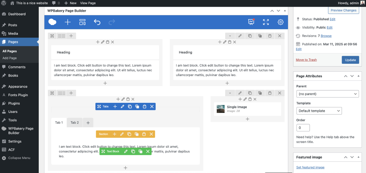
Creating and updating pages using WPBakery is much easier for non-technical users
The Theme + WPBakery combo just works for non-technical folks. Like Roxana R. explains on G2:
WPBakery has offered me an excellent user experience. You can customize your website in minutes. It is a powerful drag-and-drop editor. It has a presentation for Frontend and another for Backend. No programming skills required, which is a great advantage for any business.
Final Thoughts: Build with Clients in Mind
When you’re building a site, you’re not just delivering a front end. You’re delivering a user experience for your client too, and the experience shouldn’t require training, manuals, YouTube tutorials, or support tickets just to update a page.
If your client is a marketing manager juggling 10 other things, they don’t want to learn a new development tool. They just want to hit “Publish” and move on.
That’s why WPBakery has earned its place in the WordPress ecosystem. It empowers clients while protecting your design. It’s flexible when necessary – and locked down where it should be.