How to Create WordPress Dark Mode with WPBakery
A website that looks perfectly comfortable during the day can feel very different at night. Giving visitors the option to switch between light and dark mode solves that without committing your whole site to one visual style.
With WPBakery and the WPBakery Element Builder GPT, you can create a reusable WordPress dark mode toggle element without writing the plugin by hand. You can then control its behavior and appearance through familiar WPBakery settings.
What is WordPress dark mode and how should it work?
Dark mode is a display option that uses darker backgrounds with lighter text and interface colors. On a website, it should work as an alternative viewing mode. It should not change the page content, layout, or navigation.
By default, WordPress does not provide a standard frontend dark mode switch for every website. It’s dependent on the active theme, a plugin, custom code, or a custom element. On a WPBakery page, the mode should apply to existing content without requiring the page to be rebuilt.
- A frontend switch for moving between light and dark mode
- Support for existing WPBakery rows, columns, and content elements
- Optional detection of the visitor’s device preference
- A saved choice for future visits and other pages
- Separate colors for backgrounds, text, links, buttons, and borders
- Clear icons, keyboard control, and an accessible label for the switch
System detection normally uses the browser’s prefers-color-scheme setting. Visitors should still be able to choose another mode when they prefer one.
What to consider before adding dark mode
Dark mode can reduce glare in low-light settings and give visitors more control over how they view a website. Dark pixels may also use less power on some OLED screens. For certain brands, a darker palette can make photography, color accents, or product visuals stand out.
It does not work equally well for everyone. Light text on a dark background can appear blurry to some readers. Dark mode may also be harder to read in bright surroundings. Logos, transparent images, form fields, or sections with fixed colors can disappear or lose contrast.
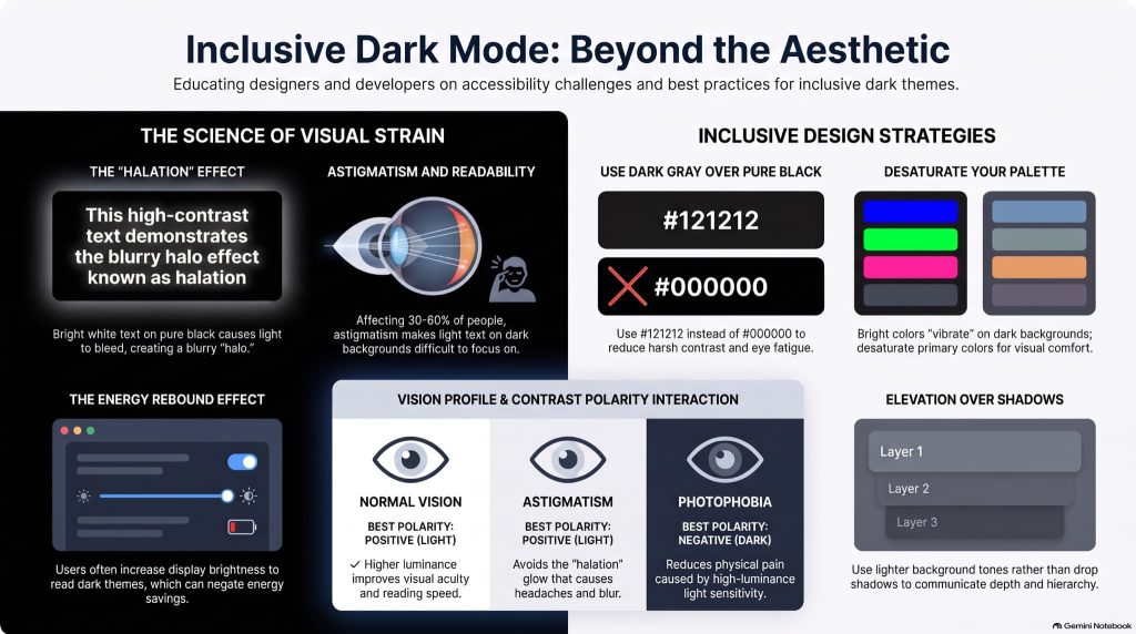
Dark mode is not a complete accessibility solution. Both modes still need readable contrast, visible focus states, and clear controls. The WCAG contrast guidance applies to the colors used in either mode.
See the dark mode effect on a WPBakery page
The example below uses an existing page built with WPBakery. The page structure stays the same. Only the visual mode changes.
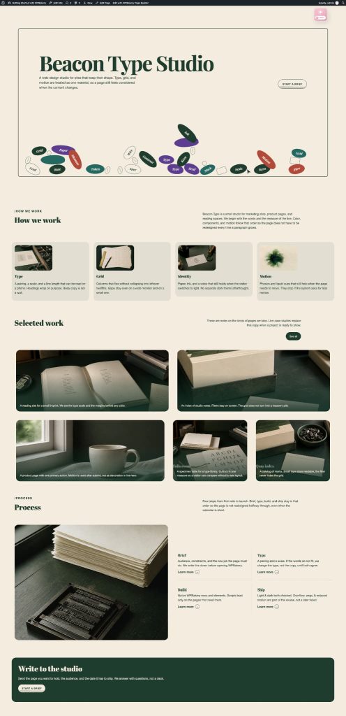
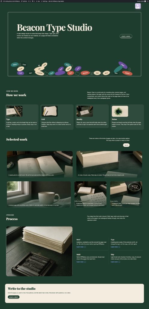
Notice how the background, text, links, buttons, borders, and other colored areas respond together. This is the result we want from the toggle. We are not rebuilding the page or editing every element separately.
Create a Dark Mode Toggle element for WPBakery
The Dark Mode Toggle starts as a plain-language request. The WPBakery Element Builder GPT turns that request into a custom element that can be added and edited from WPBakery.
If you want more background on this process, see our earlier tutorial on creating custom WPBakery elements using AI.
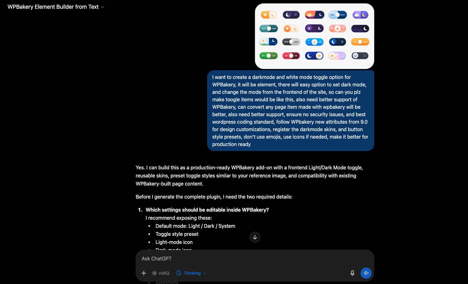
1. Describe the dark mode toggle element in the WPBakery Element Builder GPT
Open the WPBakery Element Builder GPT and explain what the element should do.
For our version, we requested an element named Dark Mode Toggle with:
- Manual light and dark mode switching
- System-level preference detection
- Saved visitor preference
- Editable light and dark color skins
- Switch style presets
- Light and dark icons instead of emoji
- WPBakery 9.x attributes and Design Options support
- Keyboard control, visible focus, and a screen-reader label
The request should also say that the generated plugin must follow WordPress coding and security practices. Be clear about the settings you expect to find inside WPBakery.
2. Review the result and refine it in chat
The first result may need a few changes. Test the behavior, then return to the same conversation with a specific request.
For example, you may ask the GPT to add another switch preset, change the default mode, correct a fixed background color, or improve how the element handles existing WPBakery content. Short follow-up requests are easier to test than asking for many changes at once.
Here is a glimpse of our WPBakery Dark Mode toggle element skins after several iterations,
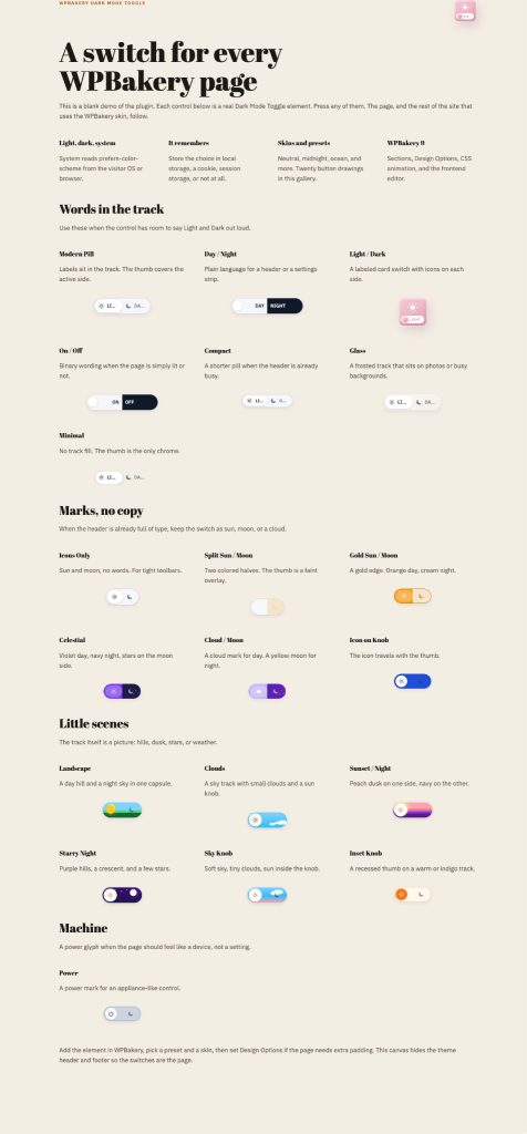
Generated code should be tested on a local or staging website. If you do not work with code, ask a developer to review it before using it on a production site.
3. Add the element and choose its WPBakery settings
Once the finished element is active, open your existing page with WPBakery and add Dark Mode Toggle from the content element window.
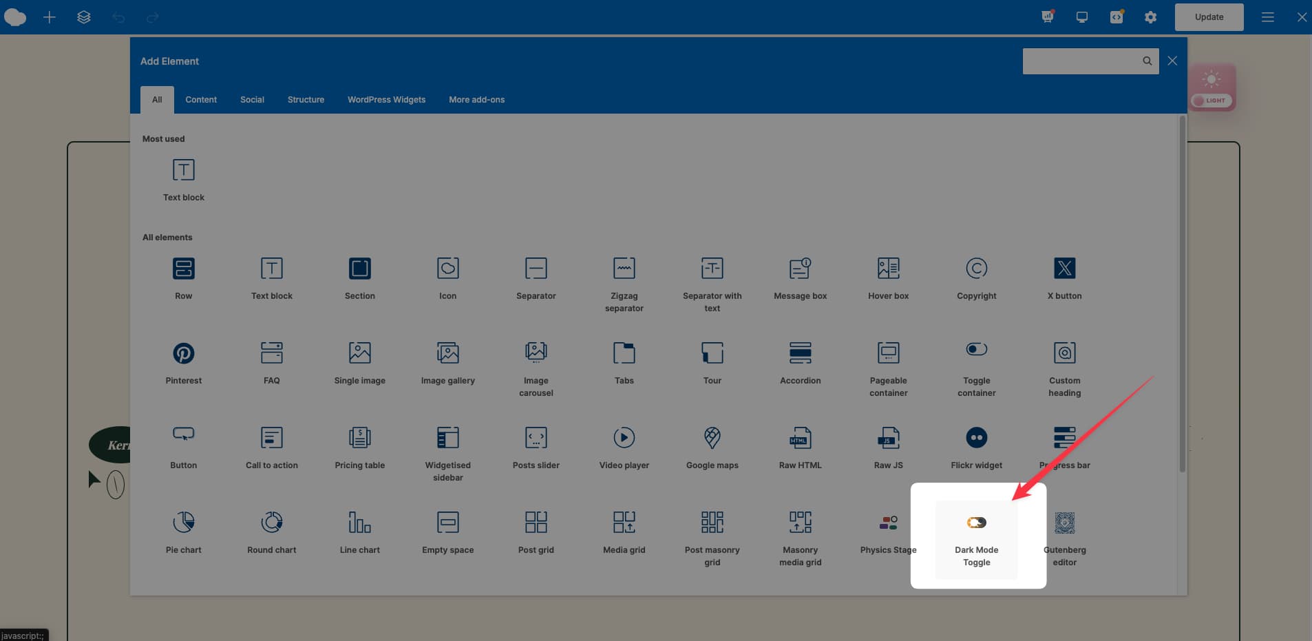
The element settings let you control the result without returning to the code. Depending on the version created, these settings can include:
- The default light, dark, or system mode
- System preference detection
- Light and dark color skins
- Background, text, link, button, and border colors
- Switch design and size presets
- Alignment and spacing through WPBakery Design Options
- An extra CSS class for page-specific adjustments
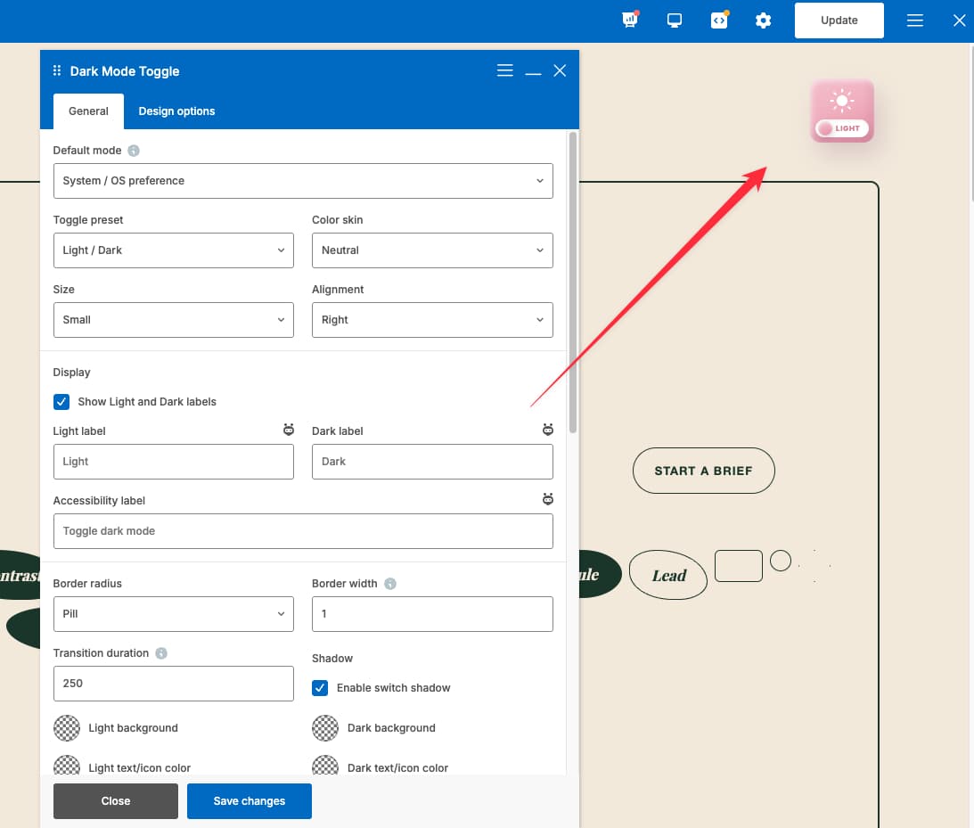
Start with the main palette, save the settings, and check the page on the frontend. Use the more detailed controls only when an existing element does not change correctly.
4. Preview, test, and refine
Switch between light and dark mode several times. Reload the page to check whether the selected mode is remembered. If system detection is turned on, change the appearance setting on your device and check the page again.
If a section keeps its original color, identify that element and adjust the element settings or request a targeted fix from the GPT. This keeps the process focused on the dark mode behavior rather than changing the page layout.
What to test before publishing the dark mode toggle effect on your WordPress site
A dark mode toggle can appear finished while a small part of the page still uses a fixed light color. Check both modes across desktop and mobile.
Review the following areas:
- Page background, rows, and columns
- Headings, body text, and links
- Buttons and their hover states
- Forms, fields, and placeholder text
- Menus, cards, borders, and icons
- Logos, transparent images, and illustrations
- Keyboard focus and switch labels
- System preference detection
- Saved visitor preference
- White flashes when moving between pages
You can use WPBakery’s custom CSS controls for a page-specific color that needs extra attention.
Dark mode is not a direct SEO ranking factor. Its value comes from giving visitors a readable choice that works reliably. Broken colors or hidden controls can do more harm than having no dark mode at all.
Bonus: use WP Dark Mode with WPBakery
If you prefer an existing plugin, WP Dark Mode includes a dedicated WPBakery element in its free version. You can place its switch through WPBakery and choose from the available styles. The Pro version adds more color and switch controls.
You can review the WP Dark Mode compatibility details or follow its short WPBakery setup tutorial.
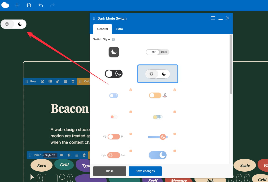
This option is useful when you want a ready-made dark mode system. The custom element route gives you more control over which settings and presets appear in your WPBakery workflow.
WordPress dark mode FAQs
Does WordPress have a built-in dark mode toggle?
WordPress does not include a built-in frontend toggle that lets every visitor switch a website between light and dark mode. A theme may provide one, or you can add the behavior with a custom element, custom code, or a dark mode plugin.
What is the difference between a dark theme and dark mode?
A dark theme gives the website a fixed dark appearance. Dark mode provides at least two color schemes and lets the website or visitor choose between them. A proper mode switch can also follow the visitor’s device preference and remember a manual choice.
Can I add dark mode without changing my WordPress theme?
Yes. A custom toggle element or WordPress dark mode plugin can apply a dark color scheme without replacing the active theme. The result still depends on how the theme and page elements define their colors, so both modes should be checked before publishing.
Can dark mode follow a visitor’s device settings?
Yes. The browser’s prefers-color-scheme setting can tell the website whether the visitor’s device prefers light or dark mode. A manual switch should still be available so the visitor can override that preference on the website.
Will the website remember a visitor’s choice?
It can. The Dark Mode Toggle element can store the selected mode in the visitor’s browser. When the person returns or opens another page, the website can apply the saved choice instead of returning to the default mode.
Does WordPress dark mode help SEO?
Dark mode is not a direct Google ranking factor. It can make a website more comfortable for visitors who prefer it, but that does not guarantee better rankings or engagement. Focus on readability, working controls, mobile behavior, and page speed in both modes.
Is dark mode always better for accessibility?
No. Dark mode can help visitors who are sensitive to bright screens, but light text on dark backgrounds can be harder for others to read. Offering both modes is more useful than forcing dark mode. Each palette still needs suitable contrast and visible controls.
Why do some logos and images disappear in dark mode?
Some logos and transparent images contain dark details designed for a light background. Those details can disappear when the background changes. Use a suitable alternate image, add a supporting background, or adjust that media item separately in the dark mode styles.
Will the custom toggle work with every WPBakery element?
It can cover common WPBakery content, but an element with a fixed inline color or its own stylesheet may need an extra rule. Test the actual page rather than assuming every item will change. Refine the generated element when a specific component is missing.
Can I use WP Dark Mode with WPBakery for free?
Yes. WP Dark Mode states that its free version includes a dedicated WPBakery element and standard switch styles. Paid features are available when you need more presets or color controls. Check its current plan details before choosing between the free and Pro versions.
Add dark mode to your own WPBakery page
Once the toggle is working, you can reuse the same element across your WPBakery pages and refine the colors or behavior as your site evolves.
Ready to add custom elements and visual effects to your WordPress pages? Get WPBakery and start building with the frontend or backend editor.
