5 Tips on How to Build a Better Product Page
If you are having e-commerce shop or sales page you must already know how important it is to display products in a customer-friendly manner. Here we talk about the quality of information, layout, and use cases – everything matters. In fact, it has a huge impact on whether potential customers will actually purchase your products.
We will browse through 5 useful tips on how to build a better product page that helps sell. The best part is that you do not have to be a highly experienced developer to start implementing these changes so just sit back and spend the next few minutes learning how to build better product pages.
Keep it Clean
Keeping everything clean and simple is the first step if you wish your customers to locate important information easily. You are asking your kids to clean up their room, right? The same thing must be done to your product page. Get rid of all unnecessary information and leave only those things that really matter. This does not mean removing everything – think about how you can hide detailed information or make it optional.
 Clean Product Layout by Adidas
Make sure that you have stressed out the most important parts like product name, price, and purchase option. On the other side make sure that things like sizes, descriptions, and other relevant information are easily accessible on demand.
Product Showcase
Product images are a must-have for any product page as they can grab customers’ attention and offer a preview of what a potential purchase looks like. In addition, high-quality images are able significantly to increase purchase rates so pay attention to how good your content actually is.
 Image Showcase by Ikea
There is often a question about how many images you should have on your product page. This varies depending on the type of product, but usually, you should stick from 3 to 7 images. Having more than 7 images results in too much information for customers and also puts additional pressure on page performance. In addition, ensure that your customers are able quickly to browse through images with simple controls and swipes.
Any additional features for images? Many customers like to see the bigger picture or examine details. Having smart image zoom or magnify options allows review products on a clean canvas without any disturbance.
Call to Action
To make a final purchase customers sometimes require a small push which can be achieved by different techniques and methods. Think about the factors that influence your customers most and stress them out. Do you offer gift wrap, free shipping, or a full refund? Such options attract users and help them make a decision.
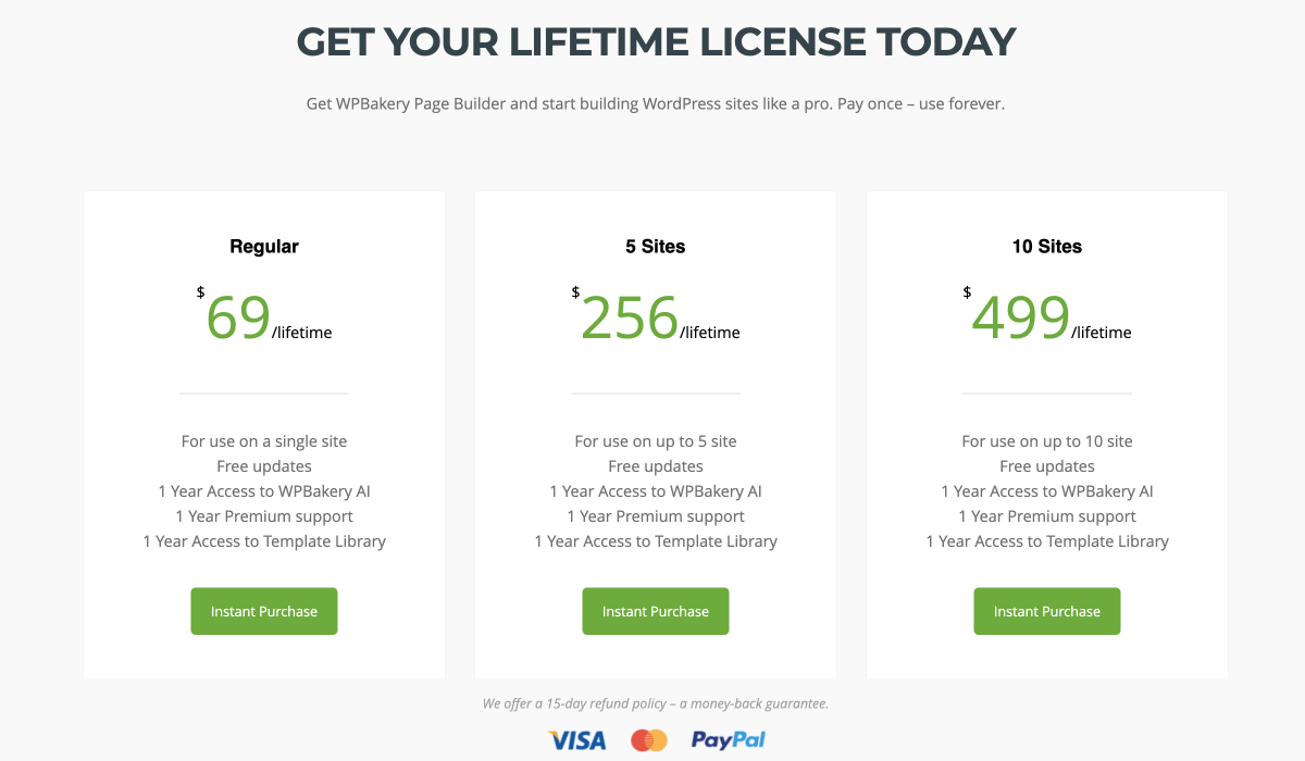
Money Back Guarantee by WPBakery Page Builder
An important part of incorporating a call-to-action block is avoiding clear statements and big blocks that attract too much attention. This is not the most important part of your product – just a nice complimentary users will love.
Split Information
We have already talked about hiding optional and secondary information, but that’s not all. You need to structure your information and make sure you don’t overload your customers with tons of content even if they asked for more detailed descriptions or reviews.
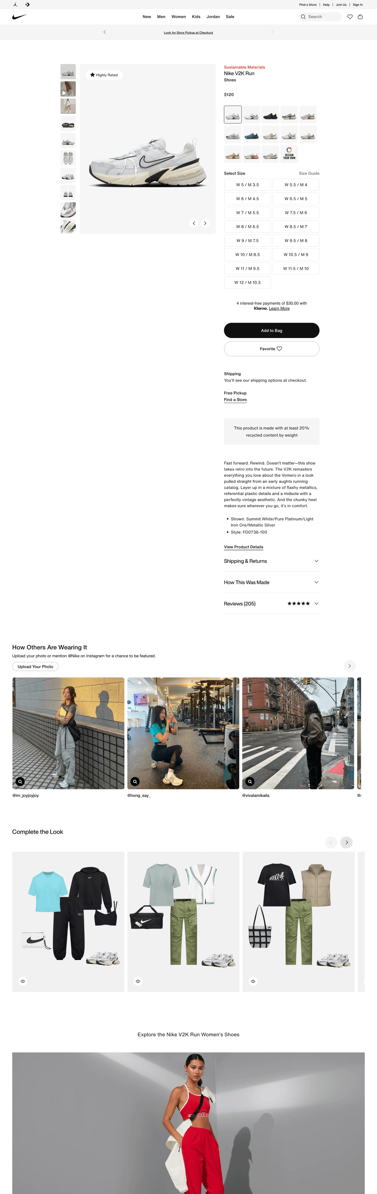
Product Page Structure by Nike
Sometimes business owners make mistakes by combining technical characteristics with product descriptions. Such an approach results in a bunch of paragraphs and tables instead of separating them into meaningful categories. For example, if you have product description, characteristics, and customer review you can think of implementing a tabs mechanism where you will have 3 separate sections. Such an approach also creates handy content navigation within your product page and helps to track data about best influences.
Mobile Commerce
With the tremendous growth of the mobile market, it is important to offer your customers a user-friendly mobile purchase experience. Investigate your site analytics to discover how many visitors are using mobile devices to access your site and what is their conversation rate. If you are disappointed with the numbers think about your information structure and accessibility as this could be the reason.
What kind of information I should display in the mobile version? Get back to information refactor once again and you will understand why it was so important to clean your site and leave only the most important parts. First, it is necessary to grab potential customer attention which can be achieved by image or smart call to action. After that, you should present the most important parts of your product description like price, category, and so on. All of the rest optional information can be hidden and available per request.
Conclusions
By looking back at the tips you can see that each and every tip is aiming to improve at least one of the factors mentioned above. At the end of the day, it all comes to refactoring and cleaning in terms of information, options, or user scenarios. E-commerce aims to make customer’s life easier so make sure your product page does that.
With WPBakery’s content elements, responsive design capabilities, and AI-driven tools for generating compelling sales copy, you’re well-equipped to create a product page that drives sales and improves customer satisfaction.