Cloudways Prepathon 2025 recap
Advertised as an event where you master the strategies to win tomorrow’s customer and build a scalable ecommerce business, Prepathon 2025 delivered on that promise and more!
Here’s our recap and takeaways from this 3-day free online event. It was organized by our friends at Cloudways and what you might have missed – just in time to get ready for the BF/CM period.
Knowing that Gen Z and Gen Alpha are redefining ecommerce with their demand for speed, personalization and mobile-first experiences, Cloudways managed to gather some of the most prominent industry leaders and experts to talk strategies, roadmaps and bridge the gap between what they need and what ecomm businesses offer. During 3 packed days, Prepathon 2025 covered topics such as AI, new customer journey, marketing tactics, growth strategies, behavioral shifts and more – all with the goal of equipping us with the needed knowledge and tools to welcome Black Friday/Cyber Monday campaigns prepared!
Gen Z and Alpha: No patience, all expectations
To better understand how young generations operate online and what they want, we’ve listened to Grant McAngus’s session. There he shared his first-hand knowledge about how to sell to a generation that doesn’t like spending and learned that younger generations simply don’t want to be bored by brands. We learned that Gen Z lives in participatory feeds, not broadcast channels and winning them means understanding their needs, perception, language and joining the conversation authentically with the goal of blending culture with commerce. One-way ads and overly polished messaging aren’t their style nor does it speak to them, you need to do it two-ways: polls, duets, co-creation, live shopping, memes…
Adding to his session, Deloitte did a survey where they discovered that:
Nearly 70% of participants stated that product reviews by content creators are viewed as more authentic than brand ads
62–63% of them say that ads or product reviews on social media are the most influential to their purchase decisions
56% of say social media content is more relevant to them than traditional TV – pointing to the weight of social over conventional media in their behavior
Take notes if this is your audience and market, folks!
People over 50: The fastest growing market in ecomm
Janis Thomas had an amazing session teaching us about how to tap into only the fastest growing market in ecommerce currently: women over 50 and how to do it WELL:
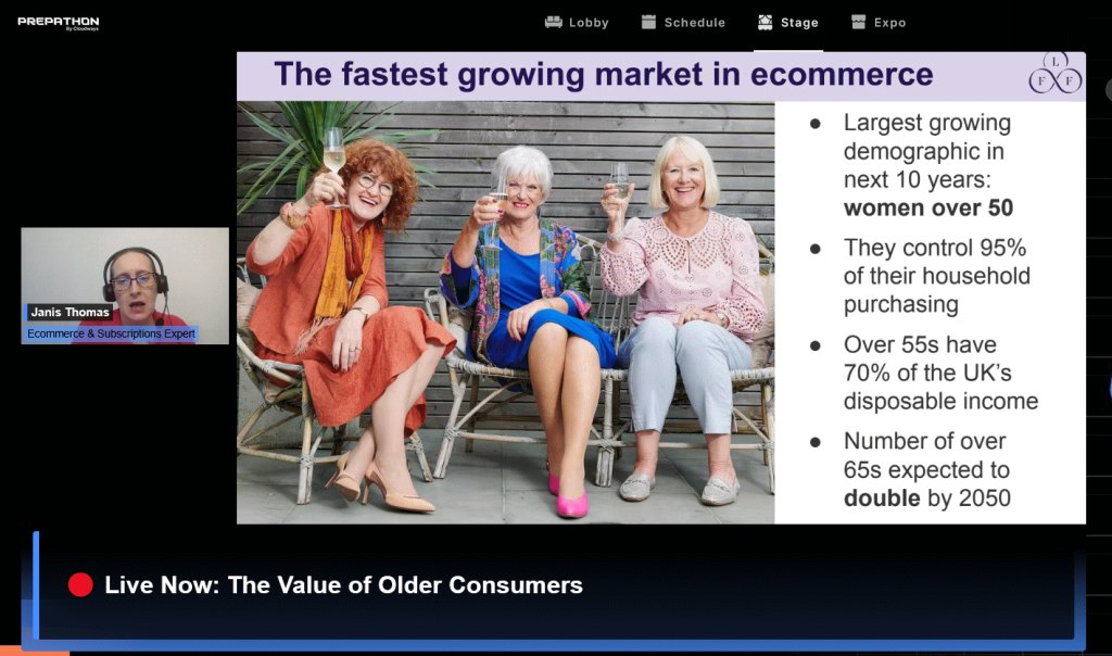
Showing us through her example of Look fabulous forever movement, Janis showed us just how older generations are more than stereotypes, what needs to be taken into account when addressing them and their needs and how, by widening your initial customer base, you can actually grow your business – by making them feel included, not as an afterthought, but as the intended audience. This tactic and a continuous effort are what drive loyalty and repeat purchases in older demographics.
With that in mind, Janis also made sure to let us understand that accessibility isn’t a checkbox. A site that’s visually clear, with readable type, easy navigation, strong guarantees and good support is not only inclusive but also increases conversion for all users.
What does it all speak to brands and ecomms?
Drop the “youth-only” tunnel vision. This demographic is loyal, has higher basket sizes and often less price-sensitive.
Design for inclusion: larger fonts, better contrast, clear calls-to-action, straightforward checkout flows.
Tell the right stories: use authentic role models from the same age group; avoid tokenism or stereotypes.
Speak to values: reliability, quality, service and legacy often resonate more than flash sales.
Remember: widening your customer base widens your revenue base.
Cut the clutter, speed the sale
It’s easy to assume that adding more features, banners and “wow” effects equals better sales. Bogdan Condurache and our Raitis Sevelis flipped that idea on its head: in ecommerce, every extra click, field, pop-up, or distraction is a leak in the funnel.
During their panel session, Bogdan and Raitis talked about how customers don’t necessarily reward complexity rather than convenience, speed and clarity. As Raitis pointed:
“We are living in a society with short attention spans and too many distractions are taking people’s attention away which is where minimal UX is really important”.
He later expanded on this statement, sharing how, if you’re able to provide UX quickly you ensure that customer becomes a loyal customer (like our users becoming Loyalty Program subscribers); if there are no obstacles and everyone’s happy – you improve chances that that customer will come back. And, he finished it by saying that a good UX is not when you add more things – it’s where you have nothing to take away from it.
Why should you care about this?
Attention is the new currency. Every second a shopper spends trying to figure out what to click is a second closer to abandoning the cart.
More elements don’t mean more value – they mean more friction. Each pop-up, banner and extra step is a chance to lose the sale.
Fast, obstacle-free journeys create trust. When the path to purchase feels effortless, customers are more likely to come back.
Minimal UX boosts both performance and loyalty. Cleaner design loads faster (better SEO, better mobile experience) and shows shoppers that you respect their time.
The winning formula is clarity > complexity. As Raitis pointed out, the best UX isn’t about how much you can add – it’s about removing anything that slows the buyer down.
Seamless shopping journeys: Removing friction from first click to checkout
Our friend Katie Keith from Barn2 Plugins talked about what ecomms need to do to improve their ROI and shopping experiences for customers. The rule of thumb she highlighted was:
“Always keep in mind what data the customer needs to make a decision – and remove everything that gets in the way of that.”
Shoppers abandon carts not because they don’t want the product, but because the journey between discovery and payment is too frustrating. To that note, here are the four common friction points Katie outlined with a brief explanation how to fix them that we expanded on a bit:
Hard to find products
Poor search filters, vague navigation labels or buried categories force customers to hunt. Every extra step increases drop-off. The fix? Make it easy to find products by adding predictive search and clear filters (size, color, price, rating) or making popular categories prominent in the main menu.
Remember: if shoppers can’t find what they came for in seconds, they’re already halfway out the door.
Unhelpful shop page layouts
Crowded product grids, inconsistent page structures, poor image hierarchy, hidden “Add to cart” buttons or unclear CTAs. The fix? Clean, consistent layouts that highlight product images, price and primary CTA. Don’t be afraid to use white space and visual hierarchy to guide the eye naturally toward the next step and keep the most important information visible without overloading the page
Point being: the shop page should feel like a curated display, not a cluttered warehouse.
Boring/limited product options
Static product pages that don’t let customers explore or personalize, the lack of alternative bundles or recommendations and such. The fix? Offer intuitive product variations (dropdowns or swatches for size, color, etc.), add bundles, “complete the look” suggestions or trending recommendations to keep engagement high. Use rich media (zoom, 360° view, short videos) to help them visualize the product.
Remember: choice should feel empowering – not overwhelming or underwhelming.
Slow cart and checkout process
Multi-page checkout, endless fields, forced account creations, slow load times. The fix? Streamline checkout: one-page or two-step flow and provide quick-pay options like Apple Pay, PayPal, Google Pay. Show progress indicators so visitors know how many steps are left.
Point being: a fast, smooth checkout is often the difference between an abandoned cart and a confirmed order.
Turn abandoned carts into easy wins
One of the most intense challenges for ecomms is abandonment flows and it’s precisely what Matias Mancheno and Ian Misner talked about alongside Matt Zambrio. Throughout their panel session, they broke down why so many customers drop off just before the finish line – and how to bring them back without feeling spammy.
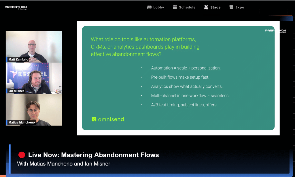
Key points of this session? Most cart abandonment still happens at checkout, often triggered by hidden fees, slow delivery promises, forced account creation, or a checkout flow that simply feels like too much work. Ian’s and Matias’s advice was clear: make it effortless for people to buy, or they’ll click away.
And the way to do it is by combining these steps:
Email first: still the foundation of recovery campaigns.
Add SMS: lifts conversions by ~47 %.
Retargeting ads: keep the brand top-of-mind.
Push notifications: give a quick nudge on mobile.
Knowing that email still is the backbone of recovery campaigns, adding SMS reminders and retargeting ads with push notifications – and layering these channels together, ecomms can really turn what could have been a lost cart into a returning customer.
Wrapping up
We couldn’t cover every session in this recap, but Prepathon 2025 proved to be an inspiring, insight-rich experience packed with practical insights and takeaways. It brought together sharp minds and usable strategies that left us with plenty to rethink, refine and apply right away in ecommerce.
Have you been to Prepathon 2025 and what are some of your takeaways? Let us know in the Community.