WPBakery 9.2: More control over your responsive design
WPBakery 9.2 is here, expanding the responsive controls and automatic responsiveness already available in WPBakery. You now have more flexibility to tailor your website’s mobile, tablet, and desktop design to your specific business needs.
The update makes it easier to fine-tune responsive design directly in the editor. Set device-specific values for supported attributes in Design Options, including margins and padding, to give your content the space it needs on every screen. Your desktop settings apply by default, so you only customize where your design needs an adjustment.
Alongside these element controls, the update brings device switching to the Backend editor, synchronizes device selection between element settings and the navigation bar, and lets you hide individual elements on selected devices.
Here are the main features in WPBakery 9.2:
- Device-specific controls for supported element attributes
- Customizable breakpoints linked to device views in the navigation bar
- A device switch with responsive stacking in the Backend editor
- Synchronized device selection between element settings and the editor navigation bar
- Device-specific visibility for individual elements – option to hide elements on specific device
- Extended developer hooks for responsive attributes within Design Options
Fine-tune elements for each device
Sometimes a layout needs different spacing on mobile. A large desktop padding value, for example, can leave too little room for text on a narrow screen.
In an element’s Design Options tab, look for the device icon next to a supported attribute. Click it, choose a device, and enter the value you want to use.
You can keep generous padding on desktop and reduce it for mobile, or adjust margins to give stacked elements more suitable spacing.
Responsive controls can also help your website load faster on mobile. For example, keep a large background image on desktop and use a smaller, optimized background image on phones. Mobile visitors load the lighter image instead of the desktop image, reducing the amount of data to download and helping them reach your content sooner.
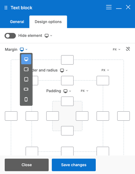 Desktop values apply across devices by default. You only need to add an override where you want a different result. Once you set a value for a specific device, that device uses its override instead of inheriting the desktop value.
You can easily undo an element’s device-specific customizations by selecting Restore auto responsiveness in its edit window menu, returning all devices to its desktop settings.
Set your responsive breakpoints
Your content should adapt at the point that works for your design. Breakpoints define the screen widths where WPBakery switches between device views.
In the WPBakery admin dashboard, open Design Options to adjust the breakpoints for desktop, tablet horizontal, tablet vertical, mobile horizontal, and mobile vertical views.
For example, if your content feels crowded at a particular tablet width, adjust the relevant breakpoint to change when WPBakery applies the next device view.
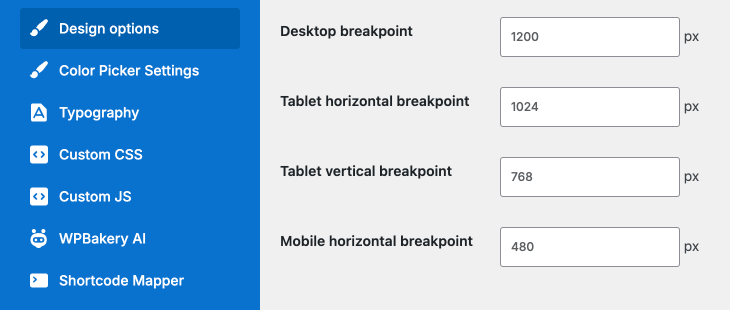 These settings are connected to the device switches in both editors, so your editing views follow the breakpoints you configure.
Responsive editing in the Backend editor
Prefer working in the schematic Backend editor? You can now use its navigation bar to switch between device types and work with responsive controls directly.
Switching device type updates the schematic layout to reflect responsive stacking, so you can see how your columns arrange themselves on smaller screens while staying in the editor you use every day.
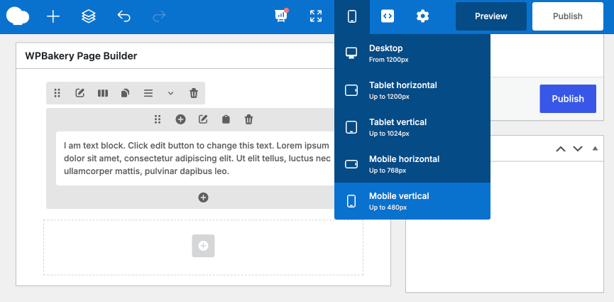 The device selector in the element edit window also stays synchronized with the navigation bar. Select mobile while adjusting an element’s padding, for example, and the editor switches to the corresponding mobile view without a separate step. In the Backend editor, you can follow how the columns stack as you make changes; in the Frontend editor, you can review the visual result.
Choose what to show on each device
Not every element needs to appear on every screen.
The Hide Element option in Design Options lets you control an element’s visibility for a selected device. For example, hide a decorative image on mobile to keep a compact section focused on its text and call to action.
This brings device-specific visibility directly into the element’s Design Options, making it easier to control individual elements.
Add responsive controls to custom attributes
For third-party developers, WPBakery 9.2 introduces extended hooks for adding responsive controls to custom attributes, with developer Knowledge Base documentation explaining the integration.
In this first version, support is limited to attributes within an element’s Design Options tab. Developers can use these hooks to bring supported custom Design Options into the same device-based editing workflow.
Frequently asked questions
Will updating to WPBakery 9.2 affect my existing pages?
No. WPBakery 9.2 is fully backward compatible, so your existing layouts will stay as they are, with no extra steps needed. Nevertheless, we recommend making a backup before every website update, whether you’re updating WPBakery, WordPress itself, another plugin or your theme.
Do I need to customize the design for every device?
No. WPBakery’s automatic responsiveness works by default, just as it did before version 9.2. You don’t need to configure each device separately. The new controls give you more flexibility when you want to fine-tune your design for a specific device or need more advanced customization.
Which attributes support responsive controls?
All default attributes in an element’s Design Options tab support responsive controls. These include hide element, margins, padding, border, border radius, background colors and images, border colors, border styles, and CSS animations. You can customize these settings for each device directly in the editor.
Can I use responsive controls in both editors?
Yes. Responsive controls are available in both the Frontend and Backend editors. The Backend editor now includes a device switch in its navigation bar, and its schematic layout reflects responsive stacking for the selected device. Device selection stays synchronized between element settings and the navigation bar, so you can adjust your content and review its layout without switching editors.
Can third-party elements support responsive controls?
Yes. Developers can add responsive controls to attributes in the Design Options tab of their own elements. This also applies to custom attributes added to the Design Options tab of existing elements. You’ll find integration details in our developer Knowledge Base.
Where can I find tutorials on using the new responsive controls?
All step-by-step tutorials for the new responsive controls are available in our Knowledge Base. Follow the guides to learn how to customize element settings for different devices and preview your responsive layouts in the editor.
How do I reset an element to automatic responsiveness?
Open the menu in the element’s edit window and select Restore auto responsiveness. This removes its device-specific customizations and restores its desktop settings across devices.
Can I customize the responsive breakpoints?
Yes. In your WordPress admin dashboard, go to WPBakery Page Builder → Design Options to adjust the breakpoints for specific devices. Set your preferred screen widths and click Save Changes.
How do I hide an element on mobile, tablet, or desktop in WordPress?
In WPBakery, open the element’s Design Options tab and use the device selector beside Hide Element to choose the device you want to target. Enable Hide Element for that device and save your changes.
How can I create a mobile-friendly WordPress website without coding?
WPBakery offers automatic responsiveness, so your WordPress content adapts to different screen sizes by default. When you need more control, its responsive settings let you fine-tune spacing, backgrounds, and element visibility for mobile, tablet, and desktop directly in the editor, without writing CSS.
Check out our latest video:
Get WPBakery 9.2
Bring your ideas to life with WPBakery 9.2. Get your license and enjoy more freedom to create a responsive website your way.
You can also update your existing WPBakery installation to try the new controls. If you don’t have automatic updates, a Support Plus subscription makes it easier to keep up with each release.
