A Guide to Responsive Settings in WPBakery Page Builder
With the rise of mobile usage, having a responsive website is more important than ever. WPBakery, a popular website builder, makes this easy with its responsive settings.
In this article, we’ll walk you through the responsive settings in WPBakery. Whether you’re new to WPBakery or just need a refresher, this step-by-step guide will get you started.
Here’s what we’ll cover:
- What does responsive mean, and why should you care?
- Breaking down responsive settings in WPBakery
- Conclusion
What does responsive mean, and why should you care?
Responsiveness means a website automatically adjusts to fit any screen size, making it easy to read, scroll, and navigate — whether on a mobile, tablet, or desktop.
Since people constantly switch between devices, it’s our job as web creators to make everything work smoothly for everyone, everywhere, no matter what device or screen size they have.
Here’s why it matters:
- Mobile usage dominates
Over 63% of global web traffic now comes from mobile devices, according to Soax. - Reduces bounce rate
According to Google, visitors are 5 times more likely to bounce immediately, if your site isn’t mobile-friendly. - Boosts conversions
Even though the majority of people still buy on desktops and laptops, they often start their search on mobile. - SEO advantage
Google has also confirmed that mobile-friendly websites show higher in search rankings. - Accessibility compliance
Web accessibility and responsiveness go hand in hand because making your website look and work well on all devices also makes it easier for everyone to access and use.

Why responsive design matters. Source: Cheezburger
As you can see, mobile-first design isn’t just a trend. It’s a way to attract visitors, gain customers, and build credibility, by making the mobile experience just as good as the desktop experience.
Breaking down responsive settings in WPBakery
When choosing a page builder for your WordPress site, it’s important to choose one that’s responsive in its core.
WPBakery includes features to make your website responsive automatically, so you don’t have to worry about responsiveness as you create and update pages.
You can also set and adjust responsiveness manually. This gives you full control over the mobile experience.
Global responsive settings in WPBakery
There are responsive settings in WPBakery that apply to your entire site. You can adjust these from the WordPress admin panel.
Disabling responsive content elements
Under the ‘General Settings’ in WPBakery Page Builder, you have the option to ‘Disable custom responsiveness for content elements’. If this box is checked, you won’t be able to set custom responsiveness settings and elements will be adjusted automatically.
Setting device breakpoints
You can set device breakpoints in the ‘Design Options’ section of WPBakery Page Builder.
A breakpoint is a point where your website layout changes based on the screen size of the device. When the layout reaches a breakpoint, the content adjusts to fit the screen. This means elements might resize, rearrange, or even become hidden.
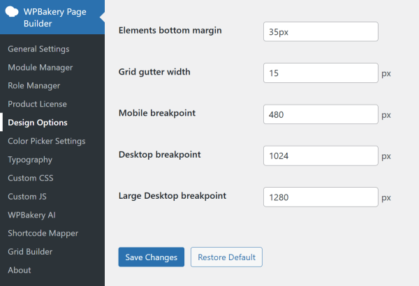
The default sizes here are pretty standard but if necessary, you can adjust them for each device type.
Note: While breakpoints are defined by your WordPress theme, you can override them using the WPBakery responsive settings.
Local responsive settings in WPBakery
Now, let’s move on to the frontend editor, where you can make specific adjustments to make sure each page looks exactly how you want on each device type.
Note that these changes can only be made in the frontend editor, which offers a visual interface specifically designed for this purpose, rather than the backend editor.
Automatic responsiveness
By default, all WPBakery templates are responsive. This means that, without any effort from your side, WPBakery will automatically adjust your content to look good on mobile, tablet, and desktop screens.
However, you can still make specific adjustments to make sure your site looks exactly how you want.
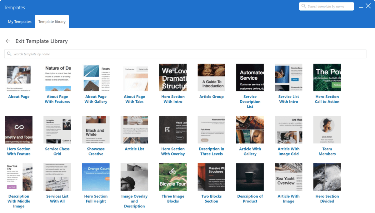
Responsive view
WPBakery allows you to preview your pages and see how they look on different devices. To do so, look for the ‘Responsive preview’ icon in the navigation bar.

From here you can check how your layout looks on mobile (portrait), tablet (landscape and portrait), and desktop, to make sure everything is displayed correctly.
Column responsiveness
When adjusting column responsiveness in WPBakery, it’s important to understand the Bootstrap grid system first. This system divides the page into 12 equal columns, and you can control how many columns are displayed per row based on the device’s screen size.
To simplify things, we recommend using a 12-column cheat row. This row, broken into 12 columns, serves as a visual reference to help you understand and adjust the width and offsets for different devices.

Keep in mind that this cheat row is meant as a guide and should be deleted before publishing your page.
How to adjust column responsiveness
As an example, let’s create a row with three columns, and adjust the responsive settings in WPBakery to display:
- All 3 columns side by side on desktops
- 2 columns in one row and 1 on the second row for tablets
- And 1 column per row for mobile devices
First, in the default view (desktop), create a row with three equal columns defined as 1/3 + 1/3 + 1/3. Here, each column takes up the space of four columns out of the twelve that make up the whole row.
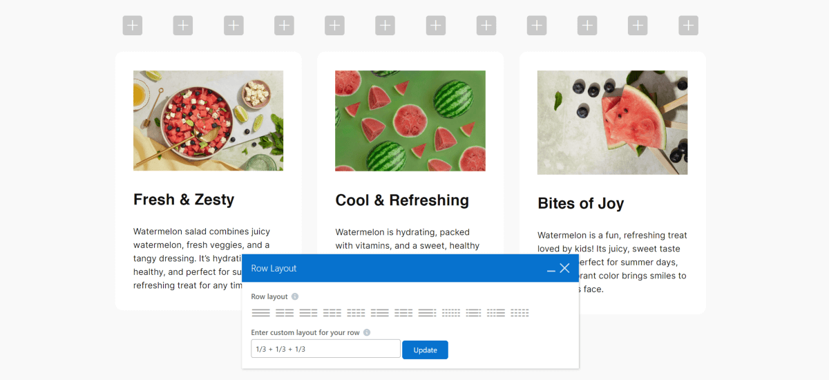
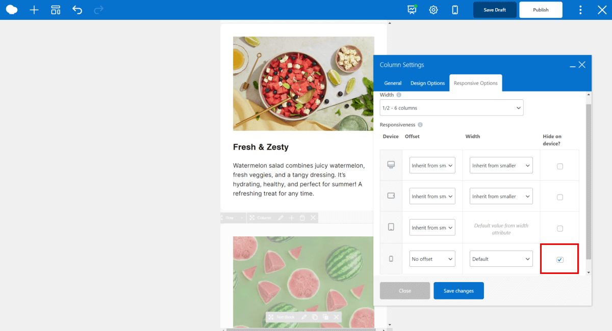
Now hover over a column, click on the ‘Edit’ icon, and go to the ‘Responsive Options’ tab. From here, you can adjust the selected column’s width, offset, and visibility for each device.
Here, make sure to set each column’s width to 1/3 (4 columns) for desktop devices, so the layout remains intact once we start adjusting the responsive settings for smaller devices.
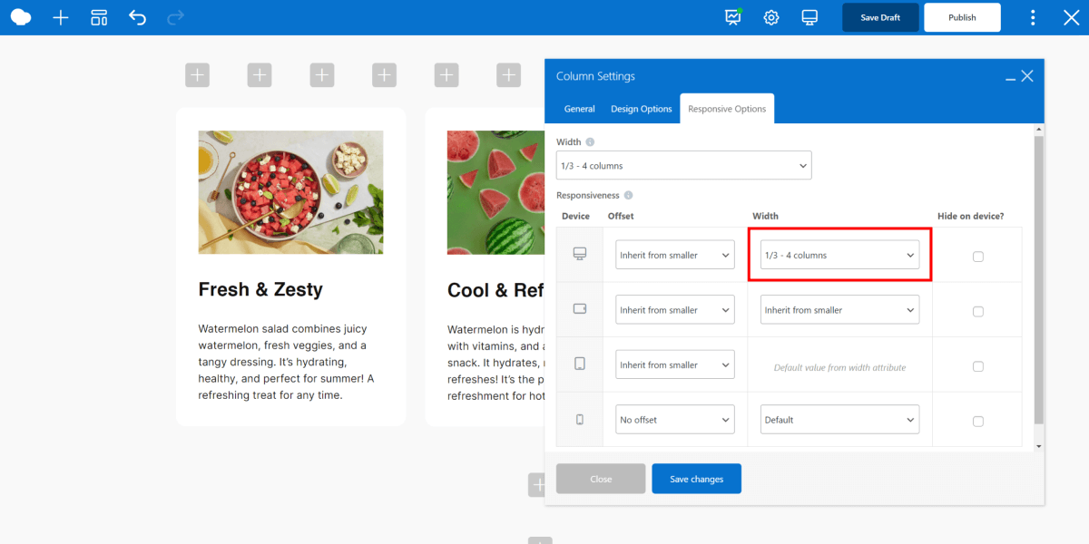
Note: You can also adjust the responsive settings for inner columns.
Next, go to tablet portrait mode.
Since we want the first two columns to fit a full row on tablets, we will set their width to 1/2 (6 columns) each, making both of them take up half of the space of a full row.
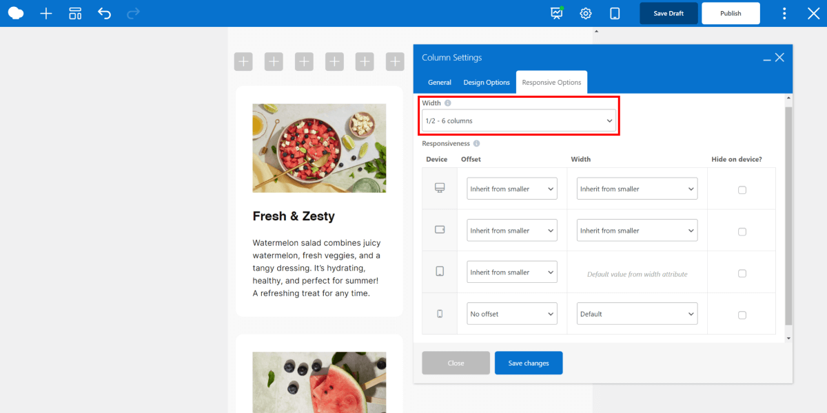
Note: Tablet portrait mode uses the default width set in the responsive options tab.
Now, for the third column, repeat the previous steps, and set its width to 1/2 (6 columns). We will show you how to center it using offset in the next steps.
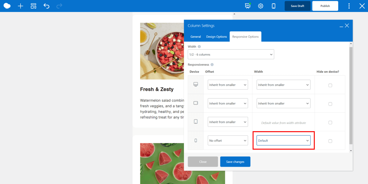
Next, if you open the mobile view, you will see each column is displayed as 1/1 (12 columns) on mobile by default, meaning each one takes up the full width of the row. This ensures visibility and readability, but it can be adjusted as well.
Now, let’s talk about offset. It manages the left side space in the column grid and moves it to the right by however many columns you define it.
For example, if we go back to the responsive options for the first column and set the offset to 1/2 (6 columns), it moves the column to the right by half, or in other words by 6 columns in the 12-column grid system.
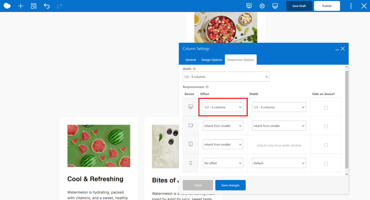
Since a row can’t exceed 12 columns, once it reaches a breakpoint, the rest of the columns are moved to the next line.
By default, the offset is set to inherit from smaller devices, due to the mobile-first approach we discussed earlier.
Now, to perfect our design, go back to the tablet portrait view, and set the offset for the third column to 1/4 (3 columns). That way, the column is centered perfectly within the middle for tablets.
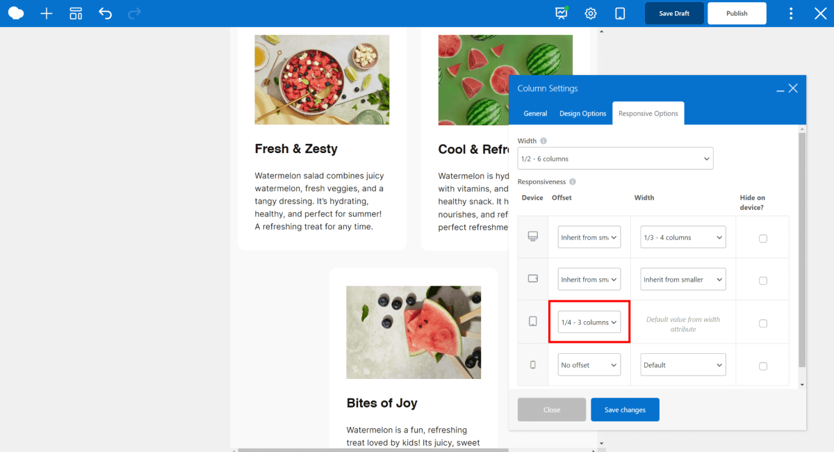
Don’t forget to switch the offset to ‘No offset’ for the rest of the devices, otherwise, it will inherit the offset from the smaller devices.
Last but not least, you can adjust the visibility of columns on different devices. It’s best practice to keep mobile simple – use fewer images, and distractions in general, so users can focus on what’s most important.
 And that’s it, always remember the 12-column cheat row if you get stuck and everything will be clear.
Conclusion
That’s everything you need to know to master responsive design with WPBakery Page Builder.
Remember to:
- Use the 12-column cheat row as a reference to keep your layout consistent and organized
- Avoid leaving offsets or widths unchanged for larger devices if they’ve been customized for smaller ones since the settings are inherited from smaller devices by default
- Always double-check how your changes look on all device views (desktop, tablet, and mobile) using WPBakery’s responsive view
By understanding these settings, you build truly responsive WordPress websites with WPBakery Page Builder.
