7 Animated Website Effects and How to Recreate Them on WordPress
Building a website has never been easier thanks to drag-and-drop tools. You can choose a pre-designed template, add content elements, style them with built-in design options and you’re good to go. But what if you want to add something extra, something unique? That’s where custom code comes in.
In this blog post, we’ll guide you through adding cool effects to your WordPress site using WPBakery Page Builder, even if you’re not a coding expert. We’ll be taking inspiration from the work of talented designers while leveraging pre-written HTML, CSS, and JS code snippets, ChatGPT, and WPBakery’s built-in AI assistant to achieve these animated effects.
Plus, if you want to recreate any of these animated effects, you can simply copy and paste the code snippets onto your website. Let’s dive in!
Text Continuous Slide
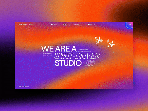
For our first effect, we’ve found a fantastic example – a marquee text slider on Awwwards, a resource that features very cool and often designed-forward websites. It’s a simple yet eye-catching effect that adds dynamism to your website.
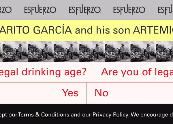
Text marquee privacy policy by EsfuerzoMezcal. Source: Awwwards
With a bit of HTML and CSS code, we can easily implement it into our WordPress site. Here’s how you can add this animated effect to a page:
- Add a Raw HTML element to the page
- Open the element edit window by clicking on the edit icon in the green controls that will appear when you hover over the element
- Insert the following HTML code snippet:
<div class="marquee">
<div class="marquee__group">
<span>Your text here</span>
<span>Your text here</span>
<span>Your text here</span>

</div>
<div class="marquee__group" aria-hidden="true">
<span>Your text here</span>
<span>Your text here</span>
<span>Your text here</span>

</div>
</div>
- Click Save Changes
- Go to the Page Setting by clicking on the gear icon on the top right
- Scroll down to the Custom CSS field, and insert the following code snippet:
.marquee {
display: flex;
overflow: hidden;
height: 10vh;
user-select: none;
gap: 2rem;
padding-top: 1rem;
padding-bottom: 1rem;
}

.marquee__group {
flex-shrink: 0;
display: flex;
align-items: center;
justify-content: space-between;
gap: 2rem;
min-width: 100%;
animation: scroll 15s linear infinite reverse;
}

.marquee__group span {
color: white;
font-size: 5vw;
font-weight: 800;
white-space: nowrap;
font-family: 'Syne', sans-serif !important;
}

@keyframes scroll {
from {
transform: translateX(0);
}
to {
transform: translateX(calc(-100% - 2rem));
}
}

@media only screen and (min-width: 360px) {
.marquee__group span {
font-size: 40px;
}
}
Click Save Changes, and voilà, here’s the result:
Emoji Cursor
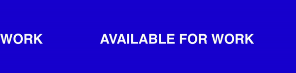
Micro-interactions have been very popular for a while now, and they’re still mentioned pretty frequently in web design trends for 2024. That’s why for this next animated effect, we took inspiration from this fun example on Awwwards.
I mean, who doesn’t love emojis? They’re like little expressions that add flavor to our conversations. Now, imagine your cursor being an emoji – like a heart or a smiley face. It’s a fun way to engage your visitors and show off your playful side.
Emoji cursor interaction by monopo paris. Source: Awwwards
To recreate this effect, we asked ChatGPT this prompt: “Can you generate code that will make the cursor a heart emoji?”. To add it to the page:
- Add a Raw HTML element to the page
- Insert the following HTML code snippet:
<meta charset="UTF-8">
<meta name="viewport" content="width=device-width, initial-scale=1.0">
<title>Heart Cursor</title>
<style>
body {
cursor: url('data:image/svg+xml;utf8,<svg xmlns="http://www.w3.org/2000/svg" width="24" height="24" viewBox="0 0 24 24"><path d="M12 21.35l-1.45-1.32C5.4 15.36 2 12.28 2 8.5 2 5.42 4.42 3 7.5 3c1.74 0 3.41.81 4.5 2.09C13.09 3.81 14.76 3 16.5 3 19.58 3 22 5.42 22 8.5c0 3.78-3.4 6.86-8.55 11.54L12 21.35z"/></svg>'), auto;
}
Once you click Save Changes, the animated effect will be applied. Here’s the result:

Strikethrough Part of The Text
With a simple hover, you can make your text come alive, leaving a lasting impression on your visitors. After all, it’s the little things that make all the difference, right?
Let’s try to recreate this interesting hover effect that applies strikethrough to text and makes Dwight from the Office appear.
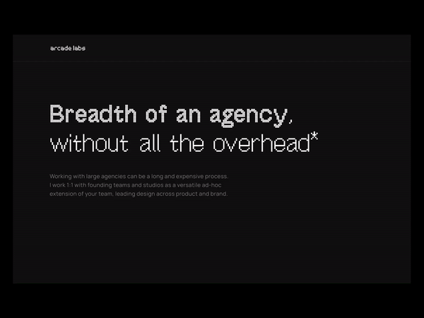
Text hover effect by Arcade Labs. Source: Awwwards
We’ll ask our handy AI – built right into WPBakery, to generate the CSS code for this animated effect. Here’s how we achieved it:
- Open the page settings and scroll down to the custom CSS field
- Click on the AI icon to the right of the custom CSS field
- Ask AI to generate CSS code for the strikethrough effect on hover (Prompt: “Write code that will add a strikethrough effect to text on hover”)
- Insert the generated CSS code:
.strikethrough { text-decoration: none; position: relative; } .strikethrough:hover { text-decoration: line-through; } - Click Save Changes
- Next, add a Text Block element to the page
- Open the element edit window
- In the TinyMCE editor, select the visual editor
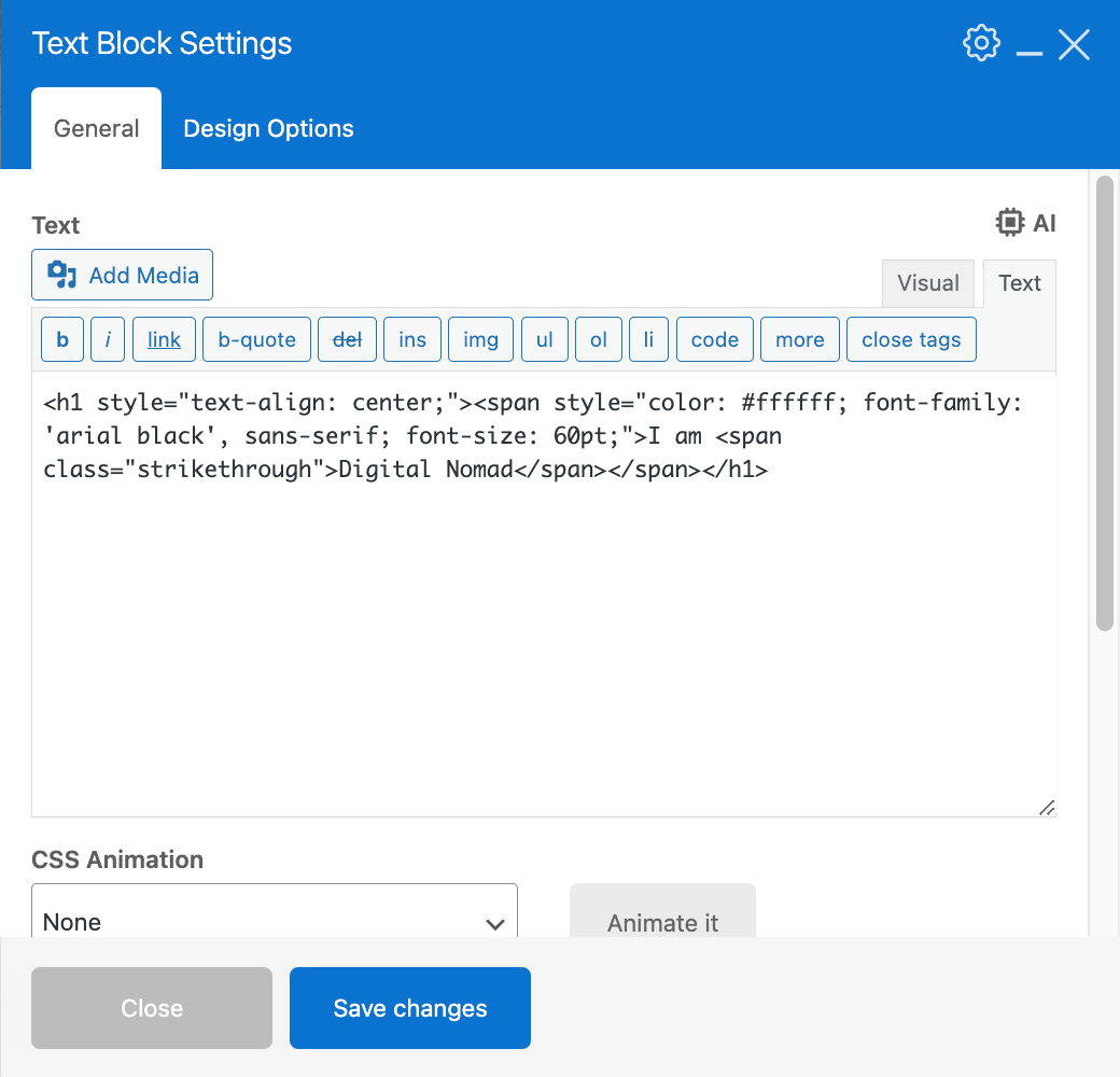
- Find the part of your text that you want to highlight (H1 in our example)
- Add an extra class name (e.g. <span class=”strikethrough”>) to the part you want to add the strikethrough to:
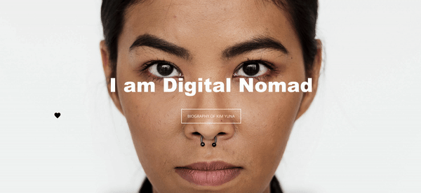
Click Save Changes and the strikethrough effect will be applied. Now just for fun, let’s try to add Dwight.
- Search “Dwight The Office” on Google
- Copy the image URL
- Ask Chat GPT to adjust the previous code using this prompt: “Can you add to this code [<h1 style=”text-align: center;”><span style=”color: #ffffff; font-family: ‘arial black’, sans-serif;”>I am <span class=”strikethrough”>Digital Nomad</span></span></h1>] and make this image [https://www.myany.city/sites/default/files/styles/scaled_cropped_medium__260x260/public/field/image/node-related-images/sample-dwight-k-schrute.jpg?itok=8TfRscbA] appear on the right of the text “Digital Nomad” on hover and the image will be resized to 100x100px and make the strikethrough effect happen on hover as well”
Here’s the output ChatGPT generated:
.strikethrough:hover::after {
content: "";
display: inline-block;
width: 100px;
height: 100px;
background-image: url('https://www.myany.city/sites/default/files/styles/scaled_cropped_medium__260x260/public/field/image/node-related-images/sample-dwight-k-schrute.jpg?itok=8TfRscbA');
background-size: cover;
background-position: center;
margin-left: 10px;
position: absolute;
top: 50%;
transform: translateY(-50%);
right: -120px;
}
Copy and paste it into the Custom CSS field in the page settings, save changes and the effect will be applied. Here’s the result:
Animated Icon on Hover
Dynamic animations can breathe life into your website, capturing the attention of visitors and guiding them through your content. Inspired by the mesmerizing mouse menu animation on Stichting Venloop’s website, we can emulate a similar animated effect by triggering a video playback on hover.
Mouse menu animation by Stichting Venloop. Source: Awwwards
To recreate this effect using WPBakery Page Builder:
- Find and download animated icons in MP4 format (we found ours on Flaticon)
- Upload the files to your WordPress media library
- Add a row with 4 columns
- Add a Raw HTML element to each column
- Add all the following HTML code snippets in the Raw HTML element:
<meta charset="UTF-8"> <meta name="viewport" content="width=device-width, initial-scale=1.0"> <title>Video Hover</title> <style> .like { position: relative; width: 100%; max-width: 150px; height: auto; overflow: hidden; display: flex; justify-content: center; align-items: center; margin: 0 auto; } .like video { width: 100%; max-width: 200px; height: auto; display: block; } </style> <div class="like" onmouseover="playVideo('likeVideo')" onmouseout="pauseVideo('likeVideo')"> <video id="likeVideo" preload="metadata" muted loop> <source src="https://testhosted.indystack.site/wp-content/uploads/2024/03/like.mp4" type="video/mp4"> </video> </div> <script> function playVideo(videoId) { const video = document.getElementById(videoId); if (video) { video.play(); } } function pauseVideo(videoId) { const video = document.getElementById(videoId); if (video) { video.pause(); } } </script> - For each next icon, replace the video link in this HTML code snippet with your video link (copy and paste it from your media library)
- Set a unique class name and ID for each of the icons in the HTML code (e.g. “.like” and “likeVideo”). If you’re not familiar with classes and IDs, simply press CNTRL + F to search for all places containing “like” and replace them with a fitting name for the next icon (e.g. rocket)
- Rinse and repeat with each icon
Save Changes after each step, and here’s the result you’ll get:
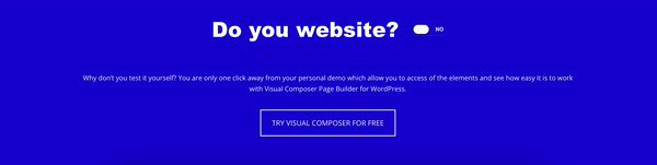
Cool Checkboxes
Even the smallest details can make a significant impact on the overall design and functionality of your website. Take, for example, the stylish checkbox designs we discovered on CodePen.
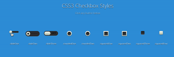
Checkbox styles by Brad Bondine. Source: CodePen
We like the third slide in particular, let’s see how we can recreate it:
- Add a Raw HTML element to the page
- Copy and paste the following HTML snippet into the element:
<div class="slideThree">
<input type="checkbox" value="None" id="slideThree" name="check" checked />
<label for="slideThree"></label>
</div>
- Click Save Changes
- In the page settings, copy and paste the following code snippet into the Custom CSS field:
.slideThree {
width: 80px;
height: 26px;

margin-right: auto;
margin-left: 0;
position: relative;
border-radius: 50px;
box-shadow: inset 0px 1px 1px rgba(0,0,0,0.5), 0px 1px 0px rgba(255,255,255,0.2);
&:after {
content: 'NO';
color: #ffffff;
position: absolute;
right: 10px;
z-index: 0;
font: 12px/26px Arial, sans-serif;
font-weight: bold;
text-shadow: 1px 1px 0px rgba(255,255,255,.15);
}
&:before {
content: 'YES';
color: #ffffff;
position: absolute;
left: 10px;
z-index: 0;
font: 12px/26px Arial, sans-serif;
font-weight: bold;
}
label {
display: block;
width: 34px;
height: 20px;
cursor: pointer;
position: absolute;
top: 3px;
left: 3px;
z-index: 1;
background: #fcfff4;
background: linear-gradient(top, #fcfff4 0%, #dfe5d7 40%, #b3bead 100%);
border-radius: 50px;
transition: all 0.4s ease;
box-shadow: 0px 2px 5px 0px rgba(0,0,0,0.3);
}
input[type=checkbox] {
visibility: hidden;
&:checked + label {
left: 43px;
}
}
}
Click Save Changes and preview the result:
Typewriter Animation
Remember the good old days of typewriters? The sound of keys tapping and letters magically appearing on paper? Well, now you can bring that nostalgia to your website with a typewriter animation. Inspired by a writer’s portfolio featuring this delightful effect, you can recreate the same magic on your WordPress site with minimal effort.
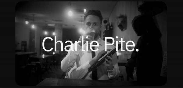
Typewriter animation. Source: Charlie Pite
Lucky for us, this one’s pretty easy to recreate. All we need is for our dear AI assistant to generate the CSS code snippet. Here’s how we did it:
- Add a Text Block element to the page
- Add an extra class name to the element (e.g. typing-animation)
- Click Save Changes
- Go to the page settings, and click on the AI icon next to the Custom CSS field
- Ask the following prompt: “Generate a typing animation for text”
- Insert the generated code
- Adjust the selector in the code, to the one we chose previously
- Click Save Changes and your effect will be applied
Here is the custom CSS WPBakery AI generated:
@keyframes typewriter {
from { width: 0; }
to { width: 100%; }
}
.type {
overflow: hidden;
white-space: nowrap;
margin: 0 auto;
animation: typewriter 5s steps(40, end) infinite, blink-caret .75s step-end infinite;
}
Here is how the animated effect will look:
Ending Words
So there you have it – some fun and easy ways to spice up your WordPress website. All you need is a handy page builder, like WPBakery, to add code snippets you find on the web or generate with AI, to your page easily. Whether you’re a seasoned pro or just starting out, these tricks will help you create a site that’s as unique as you are. So go ahead, give them a try and watch your website come to life!