Cooking Websites: My Favorite Web Design Tools | Part 2
Welcome to the second part of our web design series, “Cooking Websites: My favorite web design tools”, where we share our favorite web design tools that we use all the time. This time we’ll explore four design tools to help you create a fun and accessible 404 page.
What is the “Cooking Websites” series? If you’re looking for inspiration, you’re in the right place. Hosted by Irma from WPBakery Page Builder, this bi-weekly web design series offers a delightful array of web design tools and techniques to elevate your creative journey. Join Irma as she shares her favorite tools, along with tips and tricks, in each episode!
In this article we’ll break down the process of:
- Finding Fun Illustrations from unDraw
- Ensuring Text Readability with Typescale
- Ensuring Optimal Color Contrast with Coolors
- Adding Motion Effects with WPBakery AI
Building a 404 Not Found Page
Let’s dive into building a 404 page using Figma, the free editing software to adjust our graphics, and WPBakery Page Builder, to bring the actual page to life. These, along with the other tools on our list will help us create a page with accessibility best practices in mind.
If you’re just tuning in to this series, make sure to read part 1 for a more in-depth explanation on installing and using WPBakery Page Builder.
Finding Fun Illustrations from unDraw
First, let’s talk about unDraw. It’s an open-source library of illustrations you can use for free. Since we’re aiming for a playful and engaging 404 page, we can simply search for this term to find a fitting illustration to go with it and kickstart our design process. Plus, we can select the main color scheme upfront, for less work later on.
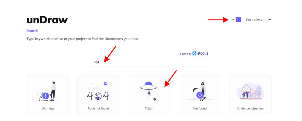
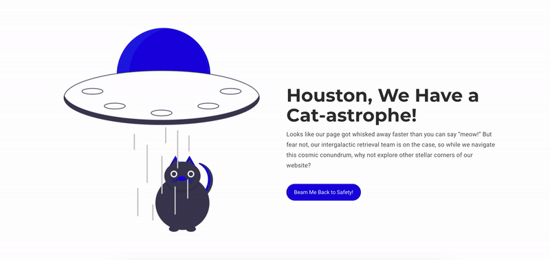
Once we find the perfect illustration — a spaceship floating in space in our case — we can download the SVG file and customize it to match our design aesthetic. You can use any vector graphic editing software to adjust the colors, reposition elements, or even combine multiple illustrations to create a unique composition.
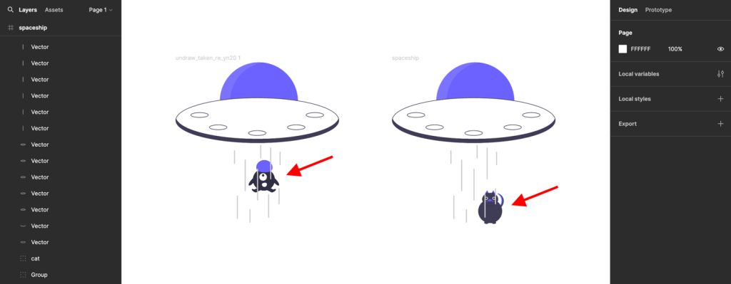
Once we’re finished customizing our illustration, it’s time to add it into our page using WPBakery. In our case, we saved the two graphics (the cat and spaceship) separately. We added one inside a row using the single image element, and the other as a background image in the same row. This setup will be important for when we start adding special effects later on.
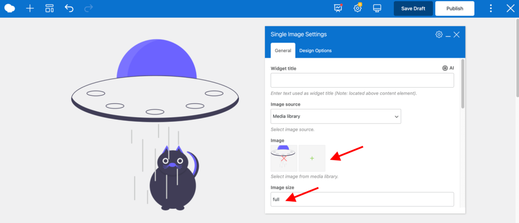
Tip: For simple illustrations like these, go for SVG format over PNG. SVGs maintain quality across screen sizes, making your 404 page look great on any device. But note that WordPress doesn’t support SVGs by default, so you’ll need a plugin.
Ensuring Text Readability with Typescale
Next up is Typescale, a tool that helps you choose the right text size for optimal readability. Consistency in text size is crucial for readability, and Typescale simplifies this process. By following Typescale’s recommendations, we can ensure that our heading, description, and button text are perfectly sized and spaced. This makes it easier for all users to read and understand the content on our page, improving their overall experience.
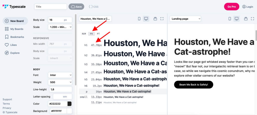
Now let’s go back to our 404 page. Using the Typescale tool, we’ll copy the recommended text size for the heading level we need (H1 in this case). Then, we’ll paste it into the custom heading element settings. By default, if you enter the size alone, it will be converted into pixels (px), but you can use root font size (rem) or points (pt) to define the size as well.
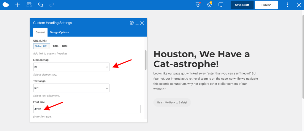
Tip: A common accessibility mistake on websites is using an incorrect heading level due to styling purposes. To avoid it, always ensure your website follows a proper heading hierarchy, starting with H1 (only one) and descending to H6, and adjust the styling manually if needed.
Ensuring Optimal Color Contrast with Coolors
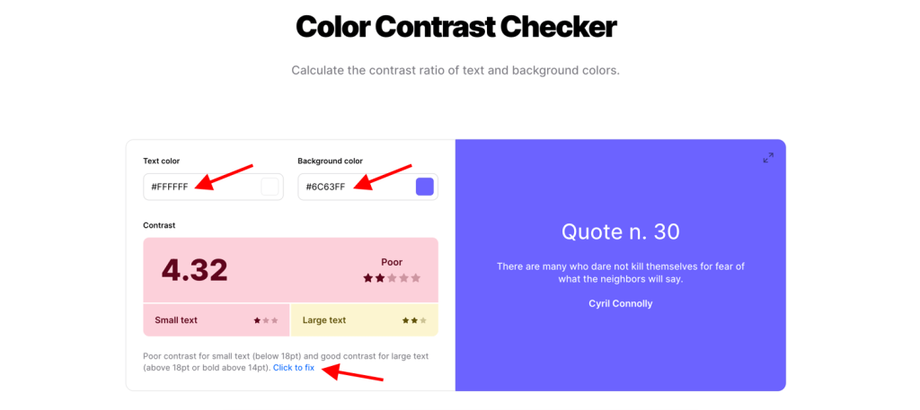
Color contrast is another important aspect of accessible web design, especially for users with visual impairments. But figuring out if colors go well together just by looking at them can be tricky. That’s where Coolors Contrast Checker comes in. It helps us check if there is sufficient contrast between text and background colors, ensuring that our content is easily readable for everyone.
In our example, the contrast checker tells us that the accent color we’re using (#6C63FF) for the button doesn’t contrast well with the white text. But if we click “fix it,” Coolors suggests a slightly different color (#0B00E0) that still works well with our design but makes it easier for everyone to use.
Now let’s go back to our editing software and make all the details in our illustration that new color as well.
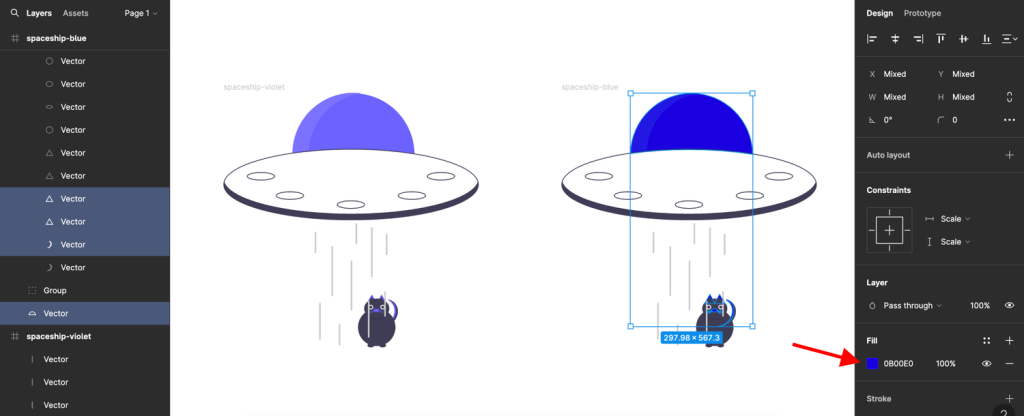
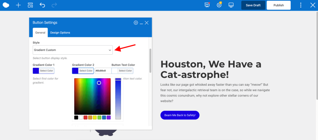
Once you’re done, swap them out with the current images in WPBakery Page Builder, and tweak the button colors using the custom gradient option in the element settings.
Tip: Coolors can also be a handy tool for finding color palettes that are inherently accessible. By choosing colors from a pre-built palette, you can ensure good contrast from the start!
Adding Motion Effects with WPBakery AI
As a bonus, let’s talk about WPBakery AI. This WordPress AI tool assists in generating custom code directly within the WPBakery Page Builder. For example, in our design, we can make the spaceship float, adding a fun touch to our space-themed 404 page. With WPBakery AI, even those new to web design can easily add dynamic and attention-grabbing effects to their website without needing to know how to code.
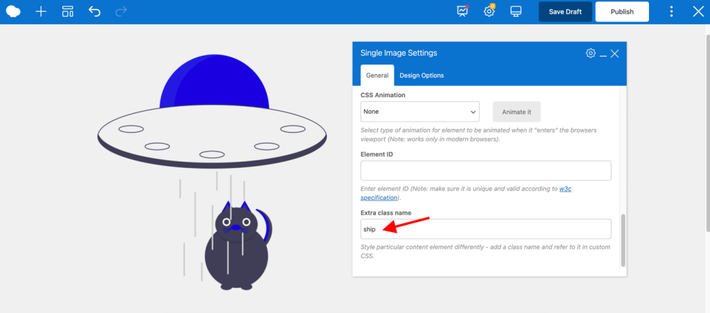
First, to achieve this effect, in the WPBakery editor give an extra class name to the single image element (spaceship in our case).
Then, in the page settings in the WPBakery editor, click on the AI icon next to the Custom CSS field. Write a prompt – “Write CSS that will add an up and down motion to an element” – and press generate.
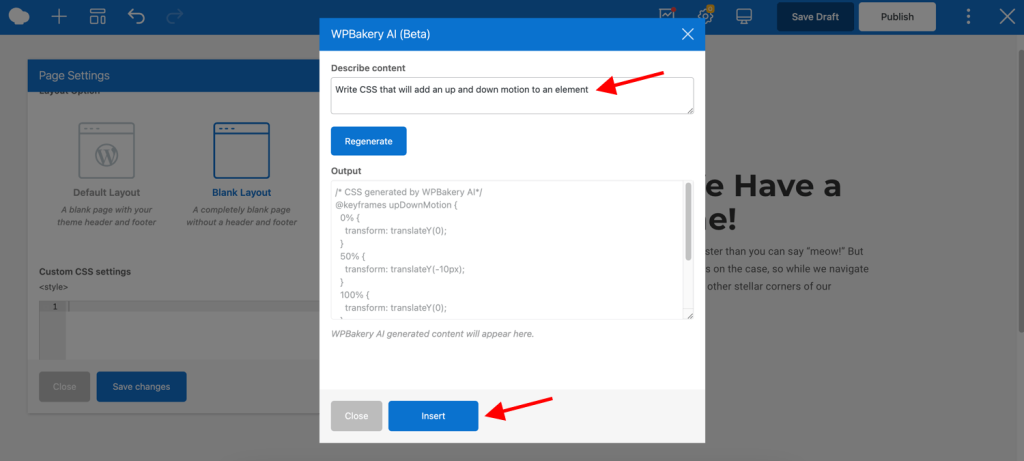
Here’s the custom CSS WPBakery AI generated:
@keyframes upDownMotion {
  0% {
    transform: translateY(0);
  }
  50% {
    transform: translateY(-10px);
  }
  100% {
    transform: translateY(0);
  }
}
.ship {
  animation: upDownMotion 2s infinite;
}
Insert the code, replace the extra class name in the code, and watch as it starts floating on our page. And just like that we achieved a simple, funny and most importantly accessible landing page design.
Afterwords
Thank you for joining us on this exploration of essential web design tools. With unDraw, Typescale, Coolors Contrast Checker, and WPBakery AI at your disposal, along with a focus on accessibility, you have all the tools you need to create awesome 404 pages that leave a lasting impression.
Stay tuned for more “Cooking Websites” episodes as we uncover new tools and techniques to enhance your web design skills. Remember to subscribe to our YouTube channel for future updates.
Happy designing and until next time!